


Data Presentation Skill

Data presentation refers to the process of visually and effectively communicating information derived from data analysis. It involves transforming raw data into comprehensible formats such as charts, graphs, dashboards, or reports to facilitate understanding and decision-making. The goal is to convey insights, trends, and patterns in a clear and accessible manner.Visualizations play a crucial role in data presentation by providing a quick and intuitive way to interpret complex information. Bar charts, line graphs, pie charts, and heatmaps are common visualization tools used to represent different types of data relationships. Interactive dashboards enhance user engagement, allowing for dynamic exploration of datasets.Effective data presentation involves thoughtful design and consideration of the target audience. Clarity, simplicity, and relevance are key principles. Data narratives, annotations, and context help guide the audience through the story behind the data.In business, education, research, and various fields, data presentation is essential for conveying findings, supporting decision-making, and fostering data-driven insights. As data volumes continue to grow, the ability to present information visually becomes increasingly important for extracting value from data and conveying insights in a compelling and accessible manner.
Data Presentation Sub Skills
Loading Skills...
Loading...
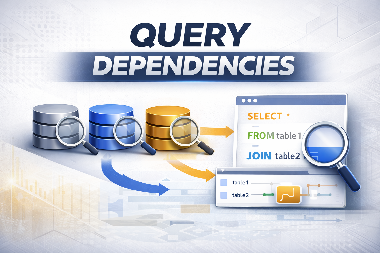
Query Dependencies in Power BI Explained
Data Science
Data Engineering: DWH and Big Data
Query Dependencies in Power BI: Understanding...

Power BI Introduction – Learn Data Visualization
Data Science
Data Engineering: DWH and Big Data
Power BI Introduction: Transforming Data Into...

Talend ETL Introduction – Complete Guide for Beginners
Data Science
Data Engineering: DWH and Big Data
Talend ETL Introduction: The Visual Data...